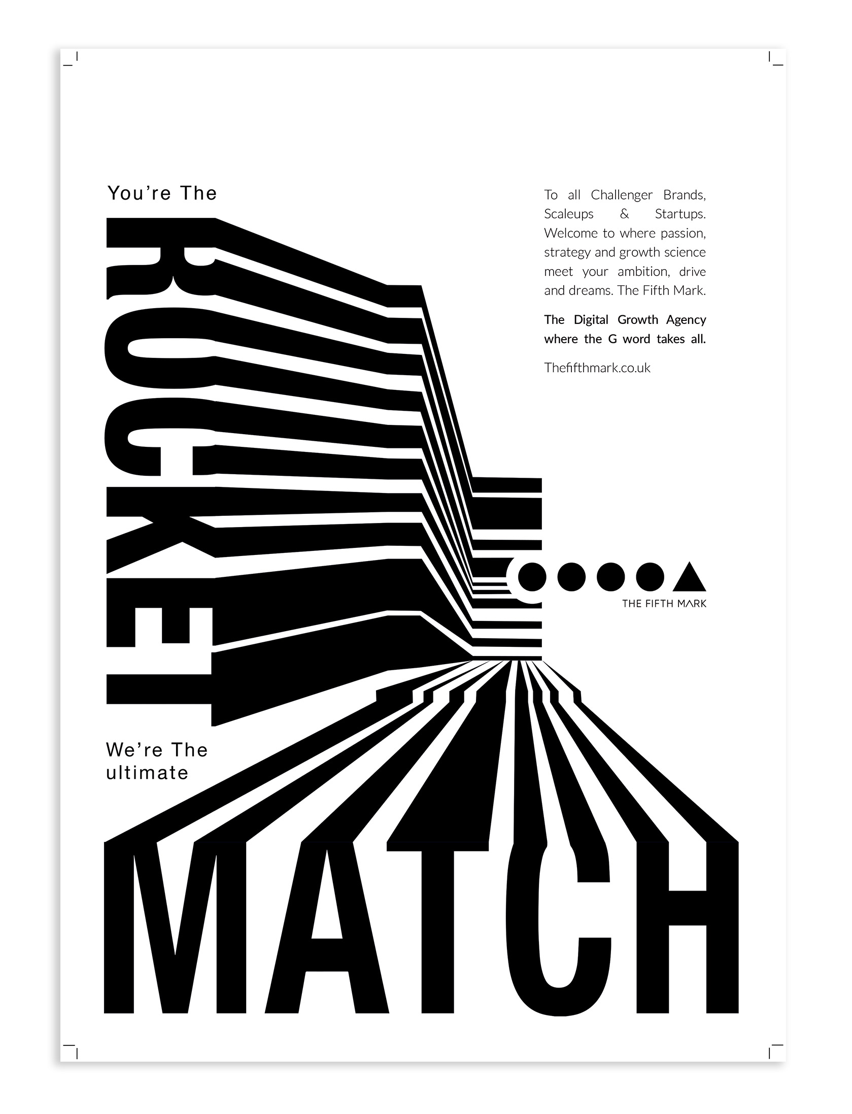
Bold Monochrome Poster Design for Media Agency Fifth Mark

Bold Monochrome Poster Design for Media Agency Fifth Mark
The agency wanted to stand out from the crowd and the industry they are in. A lot of their competition used colour and imagery and in an unoriginal way which made it easier to be different. Using a monochrome typographical solution gave the project class and confident strength. This confidence and conviction was an important feeling to get across. The poster would be seen next to lots of other posters advertising to start ups and it had to stand out.
