Protein Bar Packaging Design
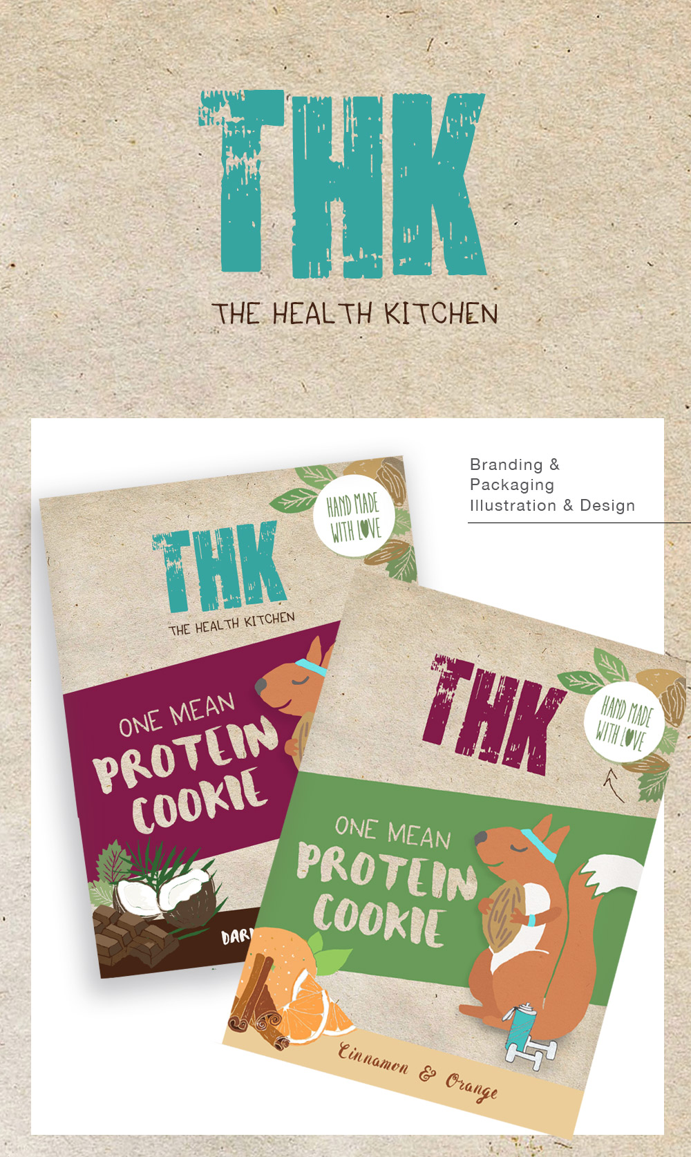
I was asked to re-design some packaging for a health protein bar through another designer who had too much work and need to offload a project. The previous design was quite clinical and sporty, we wanted to make it seem more healthy, organic and open to a broader non sport market. So I illustrated a squirrel character to make it seems more approachable with a nod to sport (sweat band and water bottle). I also created a new logo using hand drawn fonts and texture that followed the same principles (home-made, organic, natural, innocent, good for you).
I think in the end they dropped the squirrel character but stuck with a hand drawn effect that was less sporty.

