Branding for software company Exony
2013
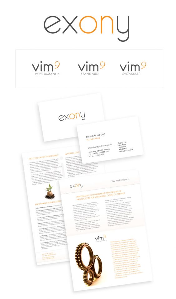
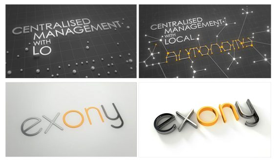
Exony are a multi million pound software company based in the US. I was approached by Simon Bunegar, Marketing Director for Exony to re-vamp their branding. The previous logo highlighted the ‘x’ of the word, which seemed pointless to me when there was the word ‘on’ hidden in there. So I highlighted ‘on’ in orange, which was their existing brand colour, that they didn’t want changing. It was also conveniently the colour of a light blub. I suggested to Simon they make an ident showing this ‘on light’ being pressed down like a button and illumination the rest of the word. So I enlisted the help of Liam Chapel, who has done idents for the likes of MTV and Dyson as a director of Mainframe, a 3D graphics company, and art directed this short 2 second video. The client was very happy and asked
It was well received and we were asked to come up with another longer video to visually describe one of their key selling points. You can see some stills from the video above. I used the concept of circuits, current and communicating networks using the branding style we created in a longer video spelling out the key phrase, followed by the button turning on logo ident.
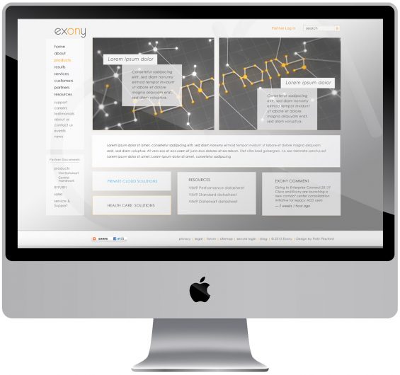
I was also asked, after re-skining their website 2 years previously, to re-vamp their website again. I made sure the branding style was in keeping with the re-brand I’d done earlier.


