Branding for recruitment agency-freelance-graphic-designer-london
The Client
For the past 3-4 years I’ve been working on presentation designs and printed material for Vertical Advantage, a recruitment company. VA approached me to help create a brand identity for their new subsidiary company Nurture. Nurture work for companies on an on-going retainer basis, taking care of their recruitment needs on a long term basis. The responsibility for the recruitment needs of their clients is taken on by Nurture. Their values are: smart, committed, accountable, problem solvers.
The New Logo
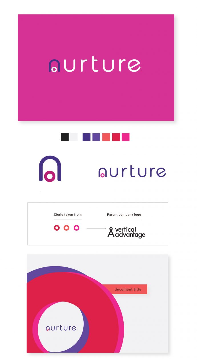
Elements of the parent company had to be retained in the new Nurture logo. I suggested an icon would be useful to enforce the brand identity in places the logo couldn’t. I took the circle from the top of the A in the original logo and placed it under the N of nurture, as if the N was a shelter over the circle. The idea being that it’s protected and nurtured, reflecting the brand’s values.
The colours needs to be bright and engaging, to make sure the brand stood out from the industry standard. This is a new business strategy in the recruitment industry, so the design needed to stand out and be different.

