Restaurant Advert Design
2017
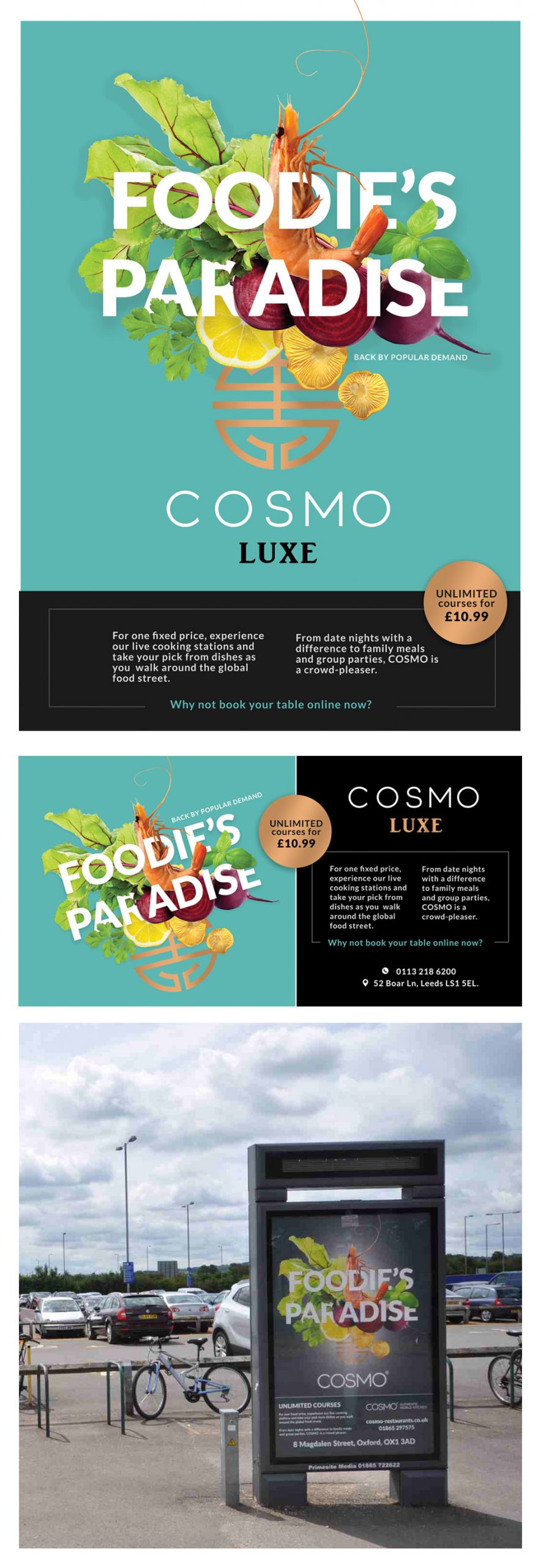
I was asked by Cosmo, to design a restaurant poster design for the launch of a new restaurant of theirs in Leeds. Cosmo is a chain of modern buffet restaurants with 21 restaurants across the UK. They wanted something bold and fresh and eye catching. I created a mood board after some research and suggested a typographical approach with some fresh ingredients designed into the type. You can make your own meal at the restaurant so using raw ingredients helped to promote that aspect, it also meant you could be less specific with the cuisine as they sever various cuisines from around the world and they didn’t want to narrow down to just Asian or European. The raw ingredients looked fresher, healthier and have brighter colours than cooked food so it worked visually too. The style needed to be modern and luxury so I thought we needed plenty of space and to keep it simple. The client was very happy with the design and they used that as a template for other restaurants like the example below for their Oxford chain. (I didn’t design the text at the bottom of that poster in the photo for their Oxford branch, I’d say they needed to work on the text layout as it looks a little cluttered… I think that was done in- house).

