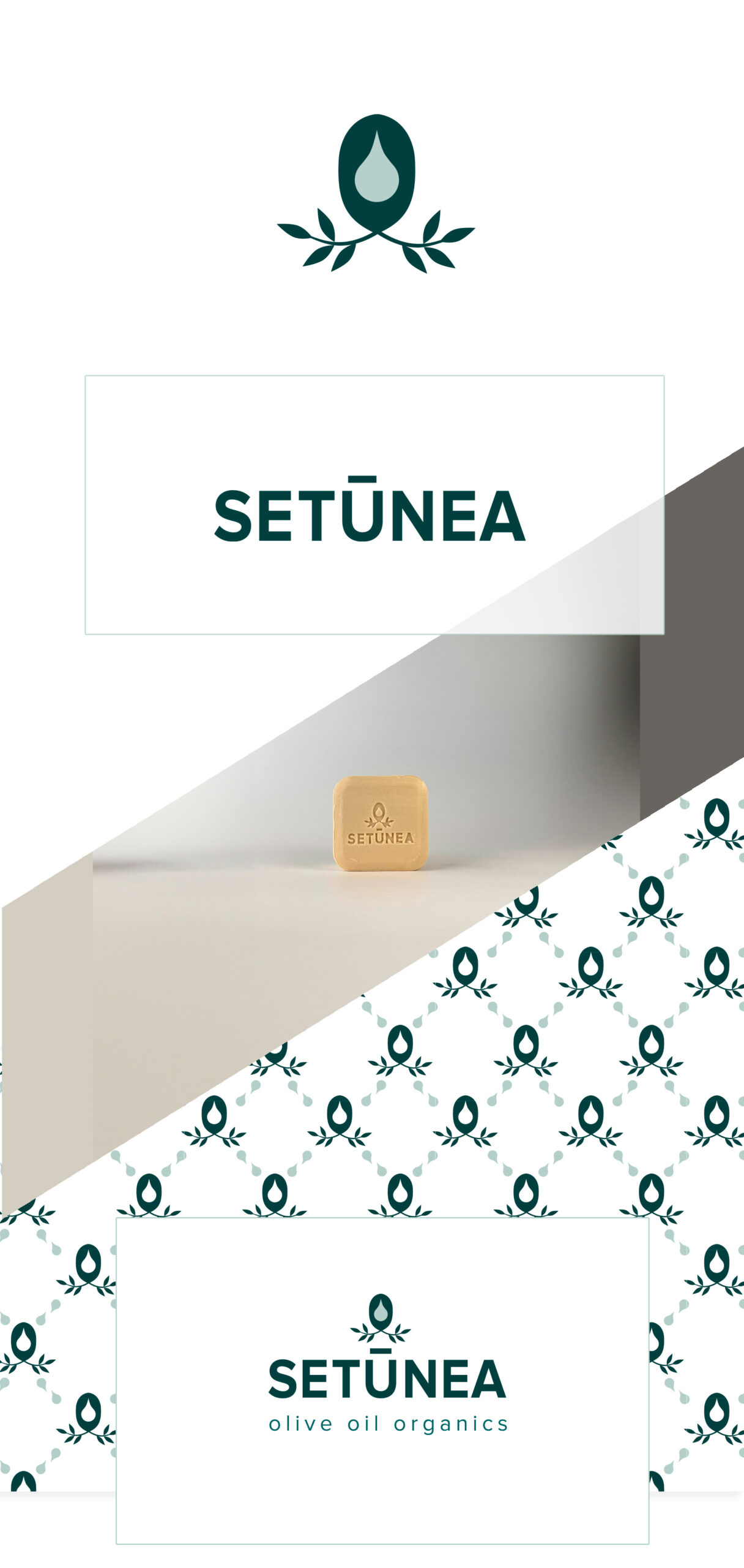

Setunea Beauty Product Branding.
I was asked to create the branding for a new soap company. The director wanted a logo that would represent his brands value and the quality of his products. The message that needed to be communicated was one of honesty, trust in natural, pure, clear and good for you. I created the icon from a sketch I doodled when I was on a flight. I find, looking out at the clouds, my mind is free to wonder. The icon includes an olive at its heart, which is the main ingredients in all his products. The drip shape in the centre, infers liquid and also beauty products in general. Then the olive leaves linked back to nature. I wanted the shape to be symmetrical so that it worked well in a repeat pattern for the packaging. I wanted the pattern to hint at a designer brand to give the brand a high quality feel. We wanted to be a natural brand but not too earthy so that it still looked high end. The brand colours are all natural tones that link to the different soap ingredients. White features heavily as that links back to an industry standard for beauty products, it says clean, clear, science.
