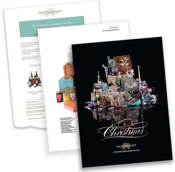
E-commerce website, newsletters and Catalogue designs for Fortnum & Mason London
2009
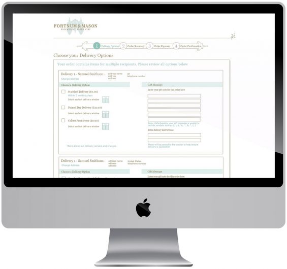
I was working for Paul Lewis design agency on a freelance basis when we pitched and won the re-development of the Fortnum and Mason e-commerce web design project. I was the principle designer working on the project with Paul Lewis and it was a fantastic opportunity for me on my first year out of art college. The site was extensive, with a huge product range, several restaurants and background history pages on the products, their sources and the company. We also designed their emails and newsletters.
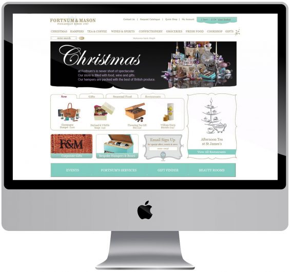
Paul and I visited the shop on a research trip and used architectural elements in the website structure to make sure the website was in keeping with the historic brand. The web design was well received and Christmas sales when it was launched in 2009 were over double the previous year. The re-design was featured in Design Week:
Retailer Fortnum & Mason is relaunching its online store this week, created by Paul Lewis Design.
The consultancy was appointed in spring following an unpaid creative pitch against four other groups.
One of these was Red Box, which designed the previous website and has built the new site.
‘The website had lost some of its brand identity, but the new one is cleaner and has a much stronger branded look and feel,’ says Fortnum & Mason head of home shopping Steph Ridley.
Ridley describes the ‘fantastic stories’ behind the store and its products that the new site will tell through the addition of content-rich features, including video and an online magazine.
‘We were missing an opportunity before to use the website to promote elements of the store like our five restaurants, which people do not instantly recognise when they think of Fortnum & Mason,’ says Ridley.
The site will include six videos covering the history of the shop in London’s Piccadilly and its five in-house restaurants.
Paul Lewis Design managing director Paul Lewis says the look and feel of the site was inspired by the ‘architectural flourishes and details’ of the luxury food store, refurbished last year by Kinnersley Kent, HMKM, Jestico & Whiles and David Collins (DW 10 November 2005).
A lot of e-commerce websites look like they are built on a grid format, because they are, but we have taken architectural curlicues and Regency detailing, and applied them to pop-up boxes and drop-down navigation bars, to break out of the box shape and make the site feel more bespoke,’ explains Lewis.
The consultancy has also increased the amount of white space on the page, which Lewis says ‘always gives an impression of luxury’.
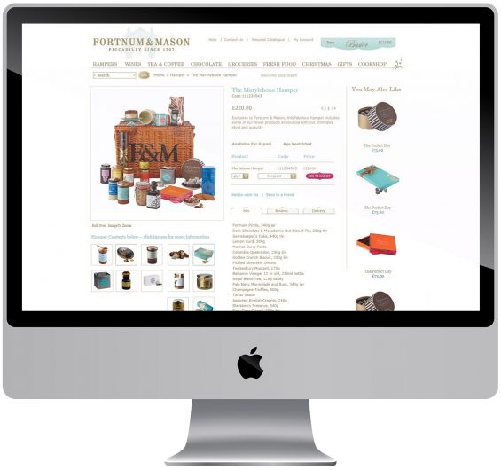
In addition, the product photographs are now bigger, ‘because selling products is the point of an e-commerce site’, explains Lewis.
Paul Lewis Design worked from Fortnum’s brand guidelines. Williams Murray Hamm created guidelines for the store in 2004 (DW 10 November 2005).
