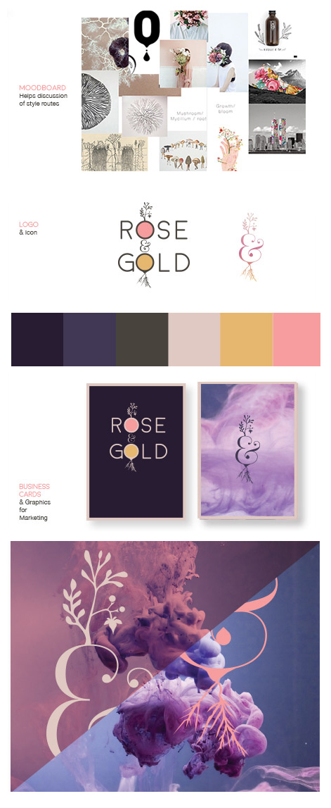
A strong brand identity has a huge impact on a business as it’s the first thing your clients see. First impressions count.
In an ever faster commercial environment, we have less time to communicate. Therefore, simple signs and strong forms are essential. Your logo should take seconds to be interpreted. The most commercially effective brands communicate these values clearly and loudly at every point of contact with their market.
With my knowledge and interest in youth culture, music, fashion as well as huge range of industries that I have been involved with over the 14 years I’ve been designing, I can help you identify the right visual signs that will link your brand with those subcultures. Connect with their tribe. If your customer identifies with your brand emotionally and intellectually, you will win their business.
BENEFITS OF GREAT LOGO DESIGN
-
- It creates Trust and loyalty, ultimately increasing sales. At its most effective it will connect you with your customers. Think of your brand like a person, the more you let your customers know what you/ your character is like, what you stand for, what makes you laugh, what’s important to you, the more they can like and connect with you. The more they connect, the more they trust, the more they buy. Think of the brands you like and why you like them. The more research you do around your customers and what they are looking for, the easier it will be to connect with them. If you can make them laugh or think of something in a new light, then you are giving them something they will appreciate and that will reflect well on your brand and ultimately, it’s revenue. With the millions of brands out there, you need to be clever about how you will stand out.
-
- Your clients remember you. If a logo, advert or social media post engaged you, the chances of you remembering that brand over the countless others is considerably higher. Original design that stands out from the crowd will bring in more business
-
- It informs customers. Your branding is often your first opportunity to communicate what you do and your brand values as quickly as possible to your target market. If your branding, colours, icons, logo, etc. are all consistent, tells your customer what you offer and how you’re different, you’ve won the first communication hurdle. If after seeing your logo, if they still have no idea if you sell ice cream or insurance then you’ve missed a vital opportunity to communicate.
-
- Looking professional. An established business will come across as more capable, trustworthy and reliable. If your logo doesn’t match up to the competition, you will lose out on their business.
-
- The process of creating a brand identity enables the client to redefine what their brand is all about, what it stands for and how it is different from the competition. Understanding your brand is an essential first part of the creative process. Once you have a more in depth understanding of your brand it will be easier to communicate your message.
-
- Promotional material. If you have well designed effective logo, it will get more traction printed on promotional material. If you’re proud of your logo, you’ll wear it on a t-shirt.
Illustration
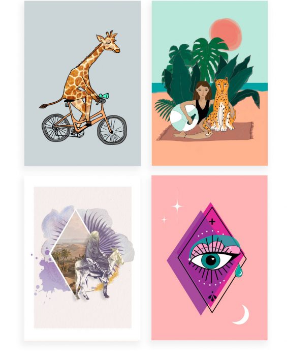
Illustration is effective. It can communicate the equivalent description quicker than it would take to read and it does that in a style that adds value to your brand by placing it subtly within cultural references.
Illustrations engage your clients more emotionally and target your message more precisely than photography, making it commercially effective.
Whether they’re created using pencils, watercolours, paper or Adobe Illustrator are a great way of adding character to branding, marketing or any other visual message you are communicating. A picture paints 1000 words, communicating some emotions that words would struggle to do.
With Illustration you can involve humour with more effect. Using a style trend will attract a young fashion conscious audience.
Illustrations are more easily recognised and stick in your memory longer. They’re good tools to associate with your brand in order to connect with a sub culture or age group. Once you have that illustration associated with your brand you can use it across a range of media more effectively that a logo. The more you paste your logo over everything in an illustrative way to add visual interest, the more everything looks the same which can look like you’re forcing the brand without much thought.
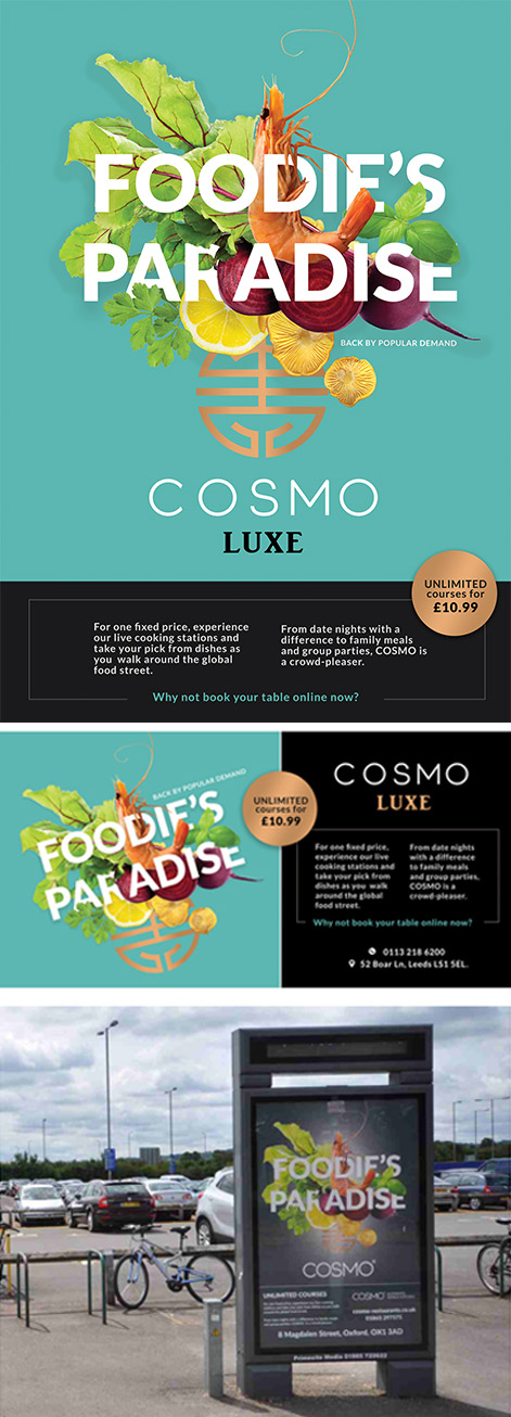
Print is more about experience than ever before. Since digital media is often where your customers head for their information, print can be a good opportunity to show off using techniques the web can’t do. It’s also direct and functions reliably in your client’s hand, whether their phone software is up to date or not. They can then take it home and leave it on the kitchen table for someone else to stumble across.
Gold foil or embossed designs elicit emotional reactions. An idea expressed using die cut shapes (cut out) in one page revealing a message on the next page behind can be dynamic and clever, conveying a secondary interpretation to your message that would be lost online. The professionalism that comes across from a business card made from thick luxury handmade paper is immeasurable. The style of the design, as always, should be extension of your brand identity, communicating your values through your materials as well as the layout design.
For some purposes printed graphics are the only option, whether it’s tube posters, magazine adverts or high-end, bound, luxury brochures. One of the main benefits of print graphics is that you can take it with you, pin it on your wall and help spread the message to others. Tactile design has more of an appeal with the increase of screen use.
Another advantage of print is reaching a not so tech savvy audience reluctant to use a smart phone or computer. If your audience is targeted and you know how to reach them, print might be far more effective than online alone.
The way the document is bound also adds another layer of meaning or aesthetic. Perhaps the biggest threat to print design is not aesthetic but issues related to the environment and sustainability. There are recycled papers that use less bleach.
Whatever the printed medium, it will still be the case that good typography and content layout composition allows the information to be legible and quickly digested.
Web

Creating a website involves design, coding, photography and copywriting. Using a freelancer who collaborates with experts to create you a bespoke website costs a fraction of what a design agency charges as there are no overheads. I’ve been collaborating with my developer for over 10 years on web projects from WordPress themes, app design to ecommerce websites. Call me to discuss the options for your project.
A collection of freelancers is better than that of an agency as you will be working with the same people consistently. We will listen to your requirements, research, plan, explore the options and suggest ways to improve the usability, UX and UI, quicker and without having to deal with a number of different staff who don’t have the same commitment to your project.
As a collective of freelancer developers, copywriters, photographers, SEO experts, 3D graphic and video editors we can bring you the expertise for a fraction of the cost and in less time. Agencies often hire freelancers to do the work anyway with the added chunk on top to cover their overheads.
Projects always starts with research followed by creating mood boards to explore the options and experiment with different concepts. Colour, flow, balance and proportion, spacing: These are the elements that make up good design. Design theory is equally important, understanding why you do what you do and why that creates a well-balanced aesthetic is important. This is often referred to as the UI design (user interface design).
UX stands for user experience, or how people feel (calm, frustrated, etc.) when they use a website, it’s a more analytical and technical field. In conjunction with the developer we’d research your users and create “personas” (profiles of imaginary ideal users). Then lay out the pages and content with a site map to figure out the path users take on your site in user flows.
Trends move fast in web design and knowing which visual techniques are trending and why or why you should not use them is important. Whether to use certain interactive techniques like dynamic Parallax scrolling often depends on the industry the client’s business is in and whether their users would benefit from the aesthetic UI pros enough to out-way the responsive UX cons.
All our websites are:
- Responsive (designed for tablets and phones)
- SEO designed (Search engine optimization)
- Have an easy to use CMS (content management system) that allows the user to edit the text and images and add new sections to the website whilst not spoiling the design.
We can integrate your social media platforms into your website in order to improve your SEO and create content.
Infographics
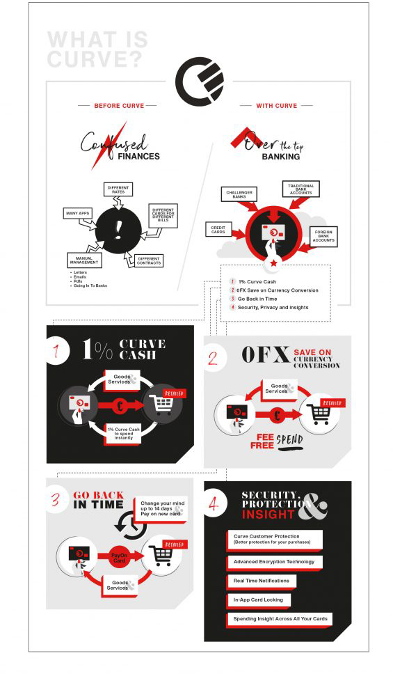
Infographic design is a way of visualising facts and figures in a faster more effective way. Apart from looking visually more appealing and being a tool to expand your brand, they can show correlations and insight into the information that text can’t do alone.
Depending on the type on content you have, infographics might be a much better route than blocks of text. It takes longer to design but it’s well worth it if you want the information to be understood. The mind processes information in pictures much faster than it does in words and humans tend to be visual creatures inherently. The quicker you process information, the faster you can make decisions.
You can get much more information across as there are more visual devices in the tool kit at hand to aid interpretation rather than just words alone. If the infographics and icons are designed well it allows people to scan over the infographic and pick out the info they want to read.
It will also provide another medium with which to express your brand visuals, rooting your brand in the visual dialogue of your target market, linking them together. The illustrative quality of your infographic can add whit, character, personality and nuances that language alone won’t be able to communicate.
If, like me your customers are visual creatures, treat them to something they want to look at and engage them with your message. This will also encourage readers to share it.
Creating interesting and informative graphics can help people learn more about you or your business and be seen as a voice of authority. Credibility is more and important in an age of fake news and endless internet content.
Infographics Can Build High-Quality Backlinks, improving SEO. Link building enables your business to rank higher in Google’s organic search results. However, links must come from relevant, quality websites with authority in their own right to propel your business forward in search. Even sites that may not be accepting guest post contributions might be interested in publishing an infographic as an alternative. These sites may also be interested in including a link to your infographic in a piece that’s already published when relevant to the content.
Packaging
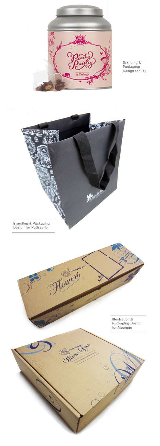
Impulse is often the main driving factor behind a purchase. Impulse is generally motivated by emotions. Packaging, when done correctly and creatively, is ultimately what sells your product. It draws attention, sends a message, and makes consumers feel a certain way. Designing your packaging with this in mind is what will make it commercially viable.
Impulse is often the main driving factor behind a purchase. Impulse is generally motivated by emotions. It’s how a product makes you feel, rather than whether you need it that makes you buy it. Yes, you may have a need for the product, but why that specific brand? The one with the sleek, expensive looking bottle? You bought it because you thought it would make you feel fancy and luxurious.
This is the purpose of packaging. Packaging, when done correctly and creatively, is ultimately what sells your product. It draws attention, sends a message, and makes consumers feel a certain way. It’s not just the designs created on the computer that need consideration. The materials you use are part of the message you’re communicating. Whether it’s a box, bottle, bag or label or sleeve, the size, shape and print process (eg. die cutting, gold foil blocking embossing) all need to be considered at concept stage.
Then there’s the ever increasingly important environmental consideration to factor in. Are the plastics recyclable or better still bio-degradable. There are some impressive developments in the packaging industry in this area, from edible liquid bubbles to mycelium (mushroom) packaging that can replace polystyrene.
Often clients come to me with their packaging solution already considered, my role in this situation would be to take the manufacturers cutter guide and create the graphics from that. I can also help from an earlier stage in the process and suggest materials and concept ideas that will help your product stand out with some original and clever ideas.
Bespoke Wallpaper
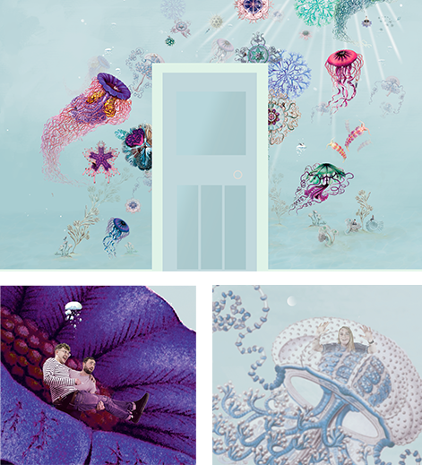
Your wallpaper is something you see a lot. Why not make it something that will make you happier. Surround yourself with great memories and the happy faces of your favourite people without compromising on interior design style. With the latest printing technology, bespoke design is now affordable.
” I didn’t tell my friends I’d hidden them in the wallpaper design as and hoped they’d find their face and be surprised. It was a lovely way to make them realise how important they were to me” – Angus – Happy Customer.
I provide an affordable bespoke wallpaper design service that takes the things you’re into and celebrates them on your wall in beautiful original designs. It’s the ultimate way to express your quirkiness and surround yourself with those things that are important to you. Design yourself happy.
