Illustrative Typography
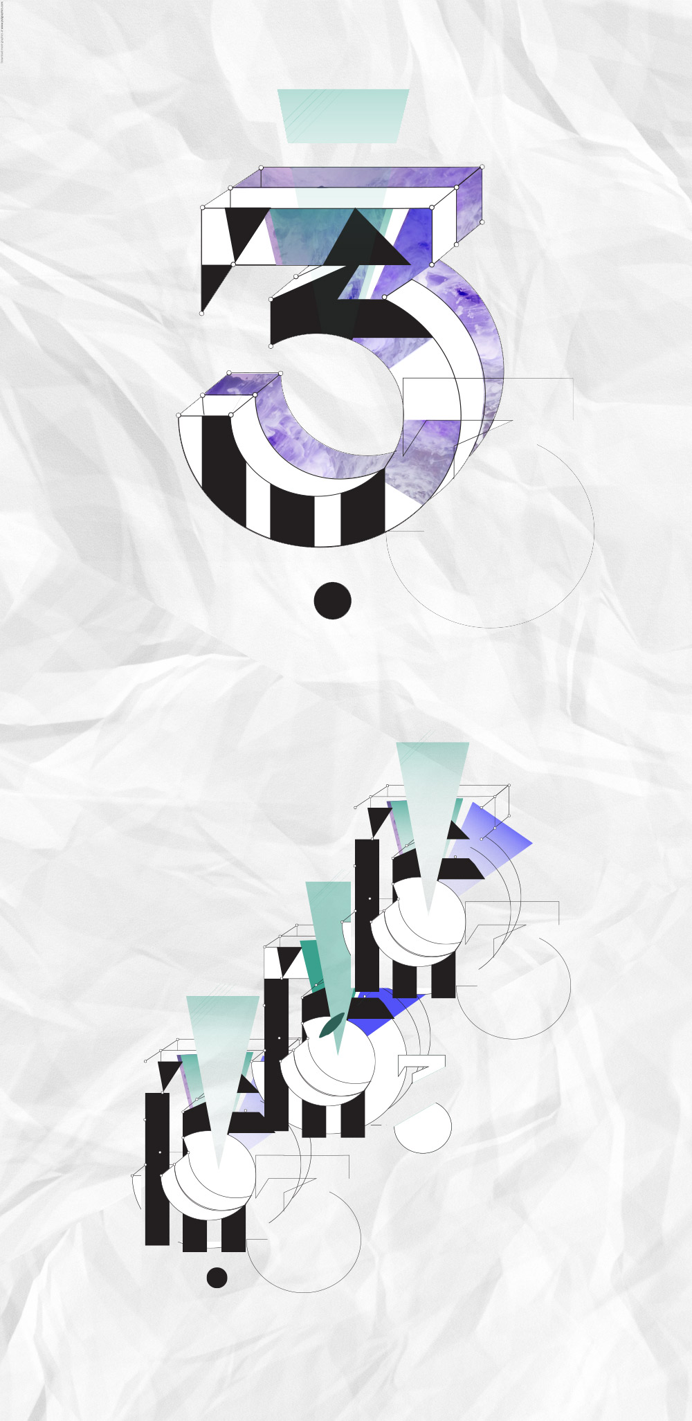
I developed this letter form and illustrated it using textures and block colour. It’s a retro 80’s style colour scheme which was designed to appeal to the East London hipsters for a music based graphic poster. The project brief changed so we no longer needed the ‘3’ but I thought I’d put this up in my portfolio as it still has appeal. It’s inspired me to work on creative more typography. Perhaps I’d go for an illustration technique that doesn’t involve computers. Paper maybe… as soon as I find them time!

