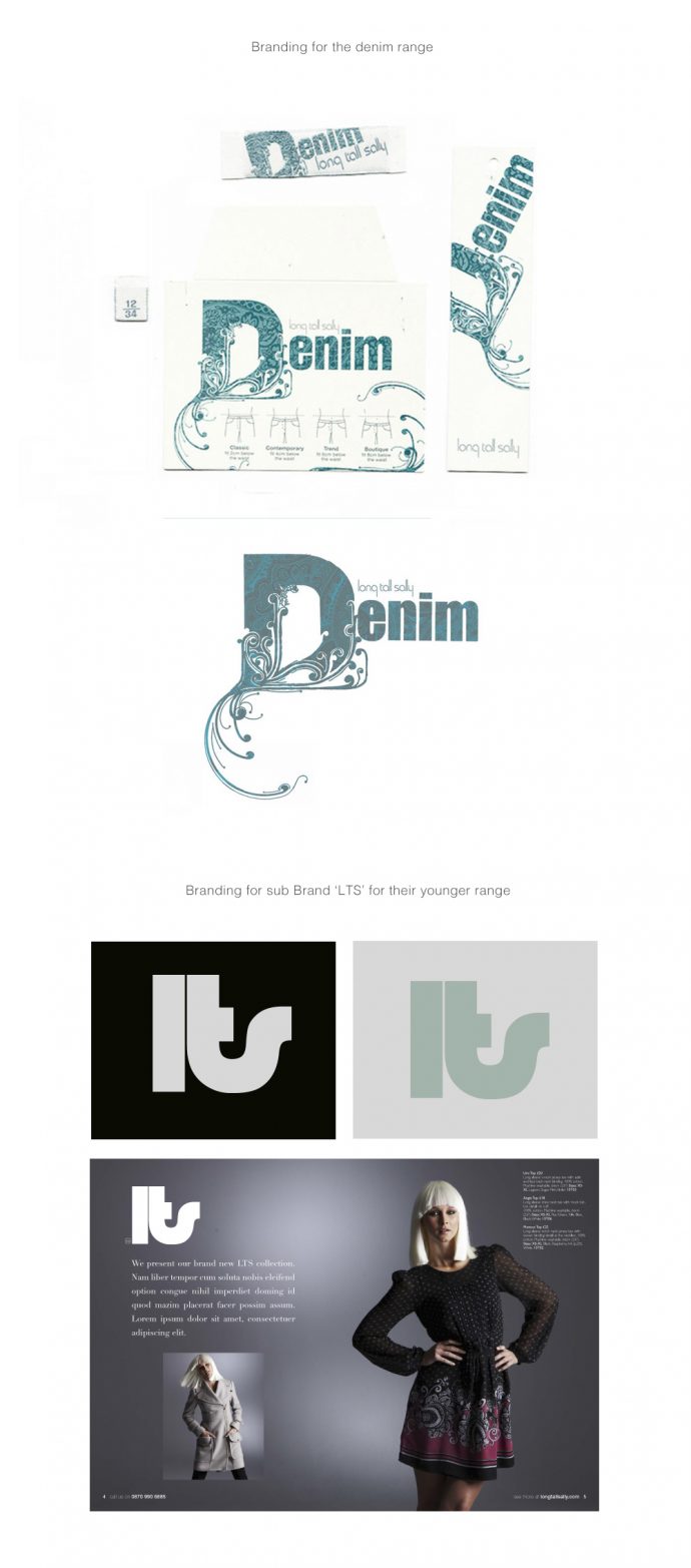
Branding & Labels design for a Denim Fashion Range for Long Tall Sally
While freelancing for Paul Lewis Agency, I designed these 2 sub brands for Long Tall Sally, a hight street clothing company for tall women. One was some Labels for a Denim Fashion Range, I designed their tags and labels, working through the manufacturing procedures with them to get the embroidered and printed look as close to my designs as possible and within budget.
I also designed a logo for their younger fashion range for teenagers, called LTS Boutique. I did all this design when I was about 1 or 2 years fresh out of art school and I learnt a lot at that agency as I was given a lot of responsibility. I also design Fortnum and Mason’s e-commerce website whilst at the agency. I was he main designer working on the designs. The client was very happy and the sales were doubled at Christmas, on the previous year. Here is the review from Design Week Magazine:
Retailer Fortnum & Mason is relaunching its online store this week, created by Paul Lewis Design.
The consultancy was appointed in spring following an unpaid creative pitch against four other groups.
One of these was Red Box, which designed the previous website and has built the new site.
‘The website had lost some of its brand identity, but the new one is cleaner and has a much stronger branded look and feel,’ says Fortnum & Mason head of home shopping Steph Ridley.
Ridley describes the ‘fantastic stories’ behind the store and its products that the new site will tell through the addition of content-rich features, including video and an online magazine.
‘We were missing an opportunity before to use the website to promote elements of the store like our five restaurants, which people do not instantly recognise when they think of Fortnum & Mason,’ says Ridley.
The site will include six videos covering the history of the shop in London’s Piccadilly and its five in-house restaurants.
Paul Lewis Design managing director Paul Lewis says the look and feel of the site was inspired by the ‘architectural flourishes and details’ of the luxury food store, refurbished last year by Kinnersley Kent, HMKM, Jestico & Whiles and David Collins (DW 10 November 2005).
A lot of e-commerce websites look like they are built on a grid format, because they are, but we have taken architectural curlicues and Regency detailing, and applied them to pop-up boxes and drop-down navigation bars, to break out of the box shape and make the site feel more bespoke,’ explains Lewis.
The consultancy has also increased the amount of white space on the page, which Lewis says ‘always gives an impression of luxury’.
In addition, the product photographs are now bigger, ‘because selling products is the point of an e-commerce site’, explains Lewis.

